The ask was to showcase the different types of boards available. As this is a category that doesn't need education, we opted to create an experience based around in-use samples of the boards.
The content is designed to both help the customer navigate the assortment and provide some direction on which board to choose, based on customer use cases.


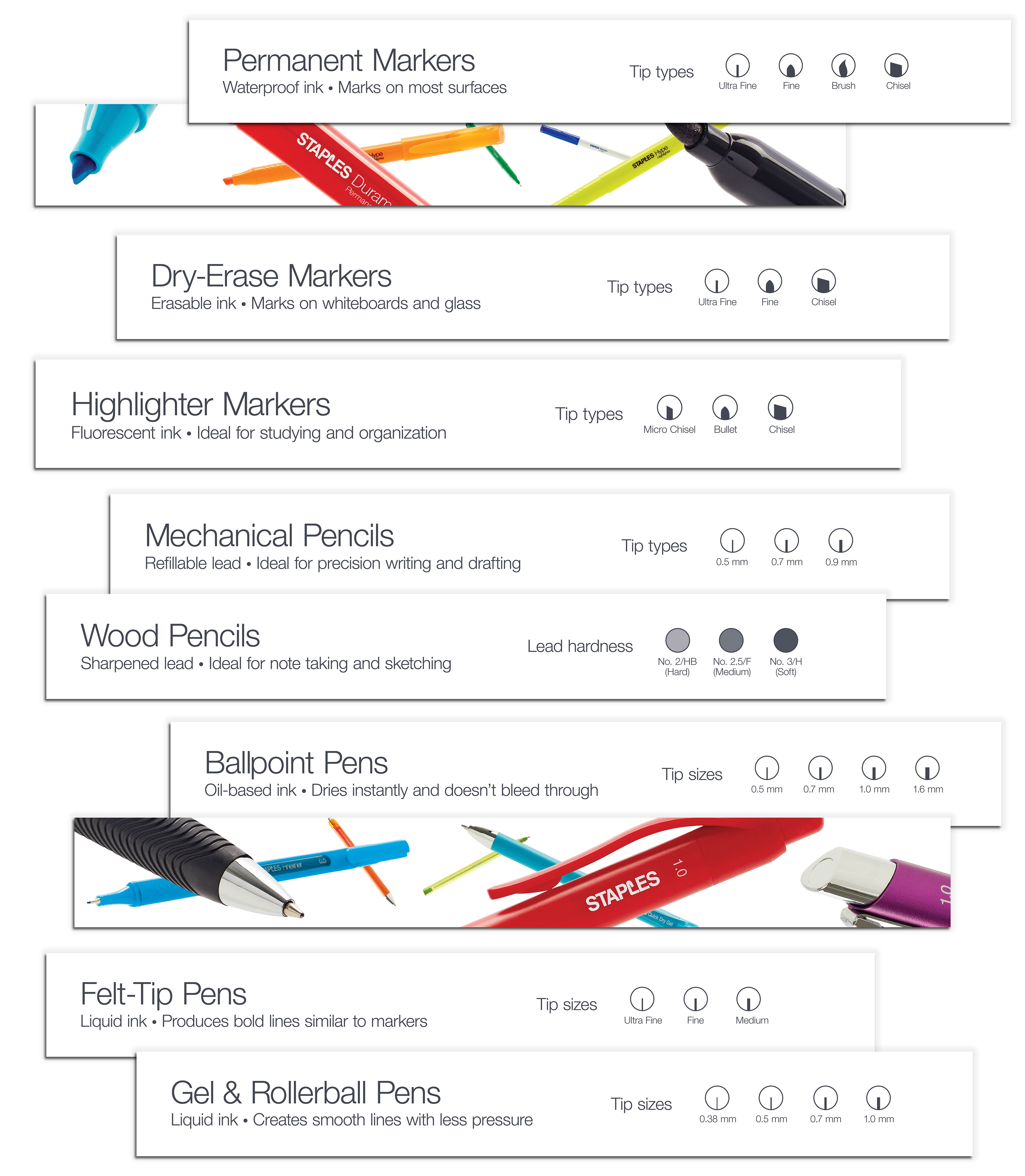
Shopping an aisle of pens can be daunting. There are so many styles and options.
We kept these signs simple and to the point — giving customers enough high-level information to help them narrow their search. The minimal content also helps quiet down a very busy product assortment.
We paired the clean, informational signs with bold, graphic pen imagery. This worked as a brand reinforcement, featuring the Staples logo and also added a focal point within the set.
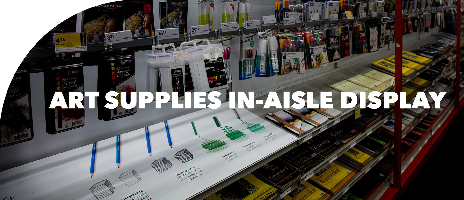
Position Staples as a destination for aspiring artists. When the art supply assortment was redone to move into a more grown-up space, we needed signage to reflect that and educate a customer who may be looking to pursue art as a hobby or professionally. Helping customers make a selection was key. We focused on different media, how to use them and provided examples of them in use.
Additionally, this set was also featured in marketing assets — which was rare for in-aisle products. The vibrant colors against the white background made for an eye-catching front-of-store sign.

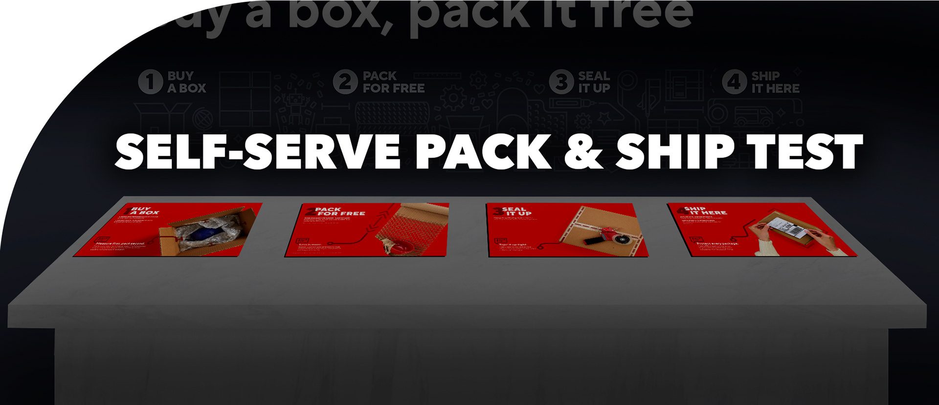
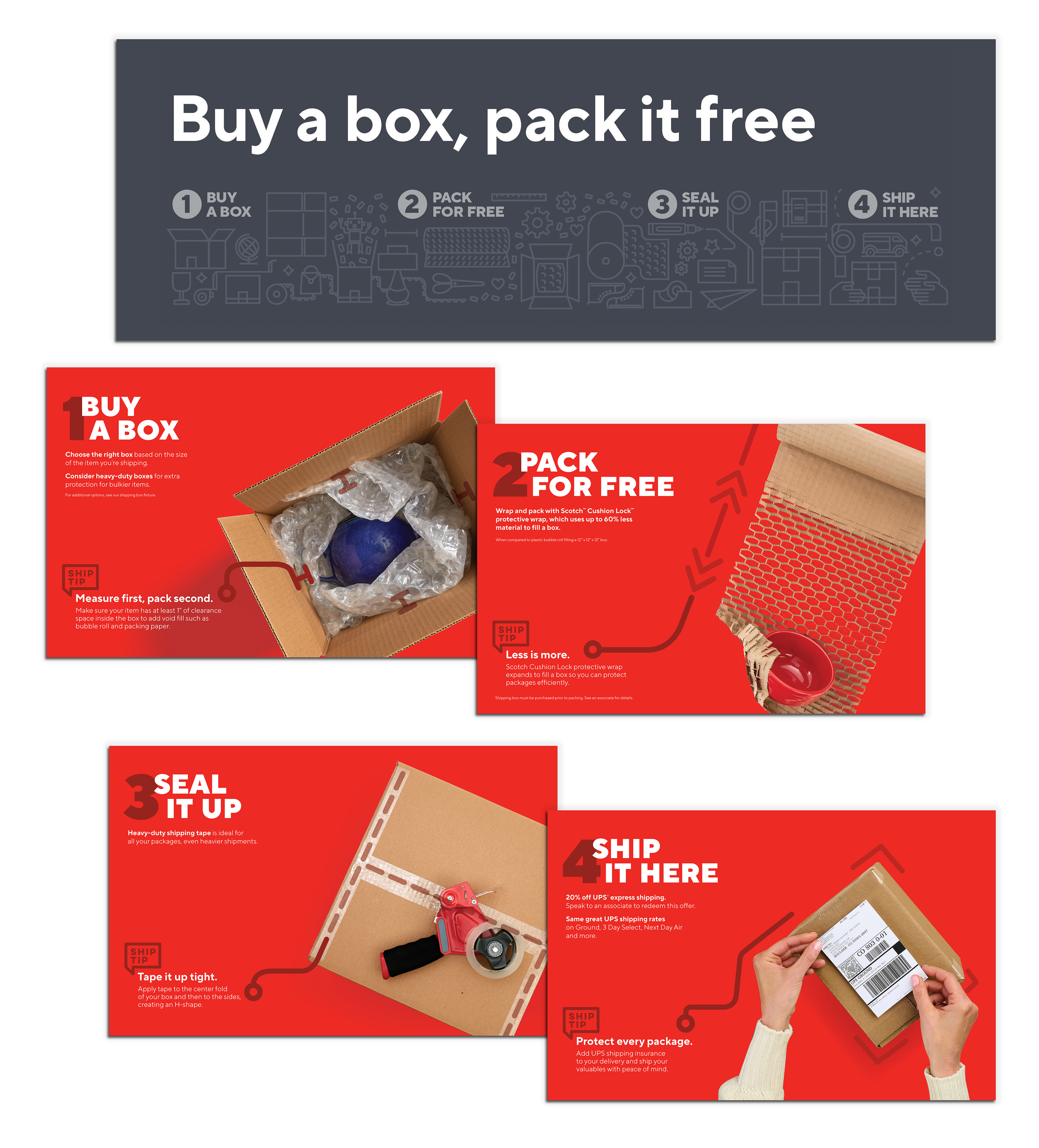
Testing out a new "pack it yourself for free" concept at the Staples shipping counter. We created signs to guide the customer with tips about packing best practices. Additionally, I created a custom illustration, in the style of other Staples illustrations, to be used as a wall graphic.