(Los Angeles, CA)
Create an entirely new store experience centered around discovery and inspiration that reintroduces Staples as the Working and Learning Store to existing and prospective customers through engaging in-store signs, interactive product displays and brand-building interior design.
This was a truly massive project that relied on my design expertise as well as project management and problem-solving skills, deep cross-functional team partnerships and innovative, tireless creativity. Hundreds of assets were concepted and produced for experiential store positions. I art directed four separate photoshoots and even provided custom illustrations for several areas of the store.

Fellowes Laminating
Our goal was to inspire customers to use a laminator for more than document protection. After some time spent researching, we came up with three ornament crafts — a perfect seasonal tie-in. We featured them in the photography and in a live display on the shelf. Customers could also scan a QR code for instructions on creating their own ornaments.

3M Command Strips
Launching ahead of the holiday season, we took a simple concept of a homeowner using Command Hooks to hang their holiday wreath and transformed it into a notice-it-from-across-the-store display by using physical Command Hooks to hand powered string lights that align perfectly to the doorframe in the photo to create a show-stopping moment.
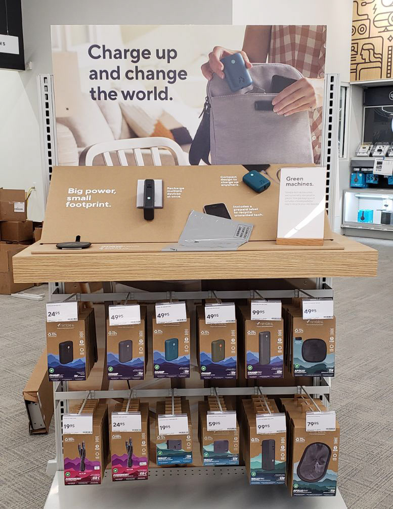
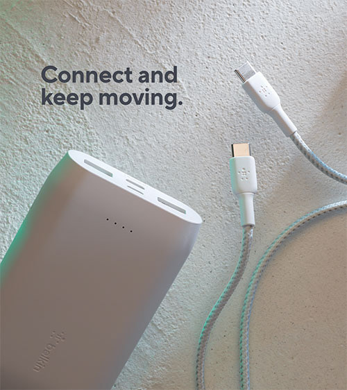
Nimble Charging
Here we helped customers discover Nimble, an emerging, environmentally conscious company focused on tech and mobile accessories. To help champion their sustainability-forward brand, we elected to print on an uncoated cardboard. I designed a wedge that could showcase Nimble’s thoughtful product design while also introducing real world applications for this essentials — from a physical wall charged mounted to a photorealistic outlet to the actual mail-back recycling bag for unwanted tech that Nimble provides with every purchase.
We were thrilled to learn that this approach led to significantly higher sales compared to a non-interactive version of this display and has become one of many benchmarks we use to promote the benefits of experiential shopping.
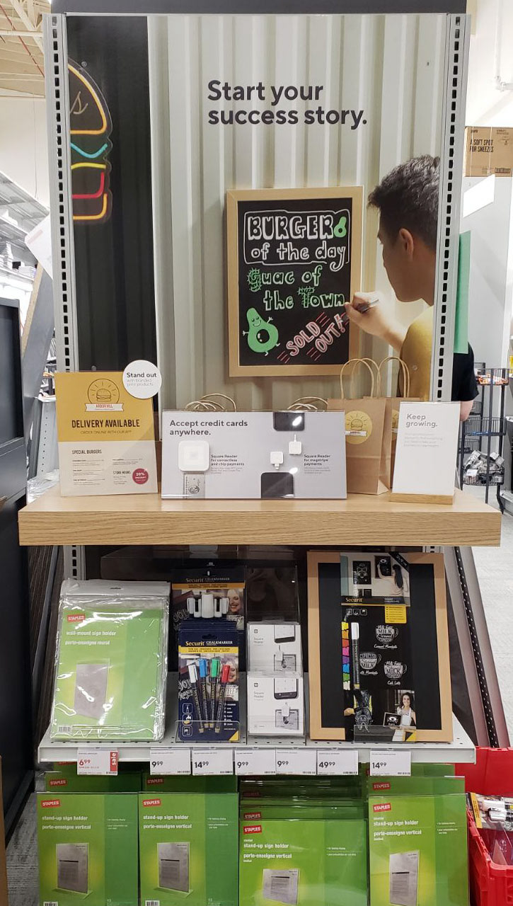
Retail Supplies
Based on the product assortment, I worked with our partners to craft a story around a restaurant owner. The story was brought to life through the custom, lifestyle photography, and enhanced with the shelf level display featuring mobile payment devices and a cross-sell to Print Services.
I worked directly with the printer to develop the mobile payment acrylic sign, that features live product affixed to the sign. To save cost, we were able to repurpose an existing sign holder.
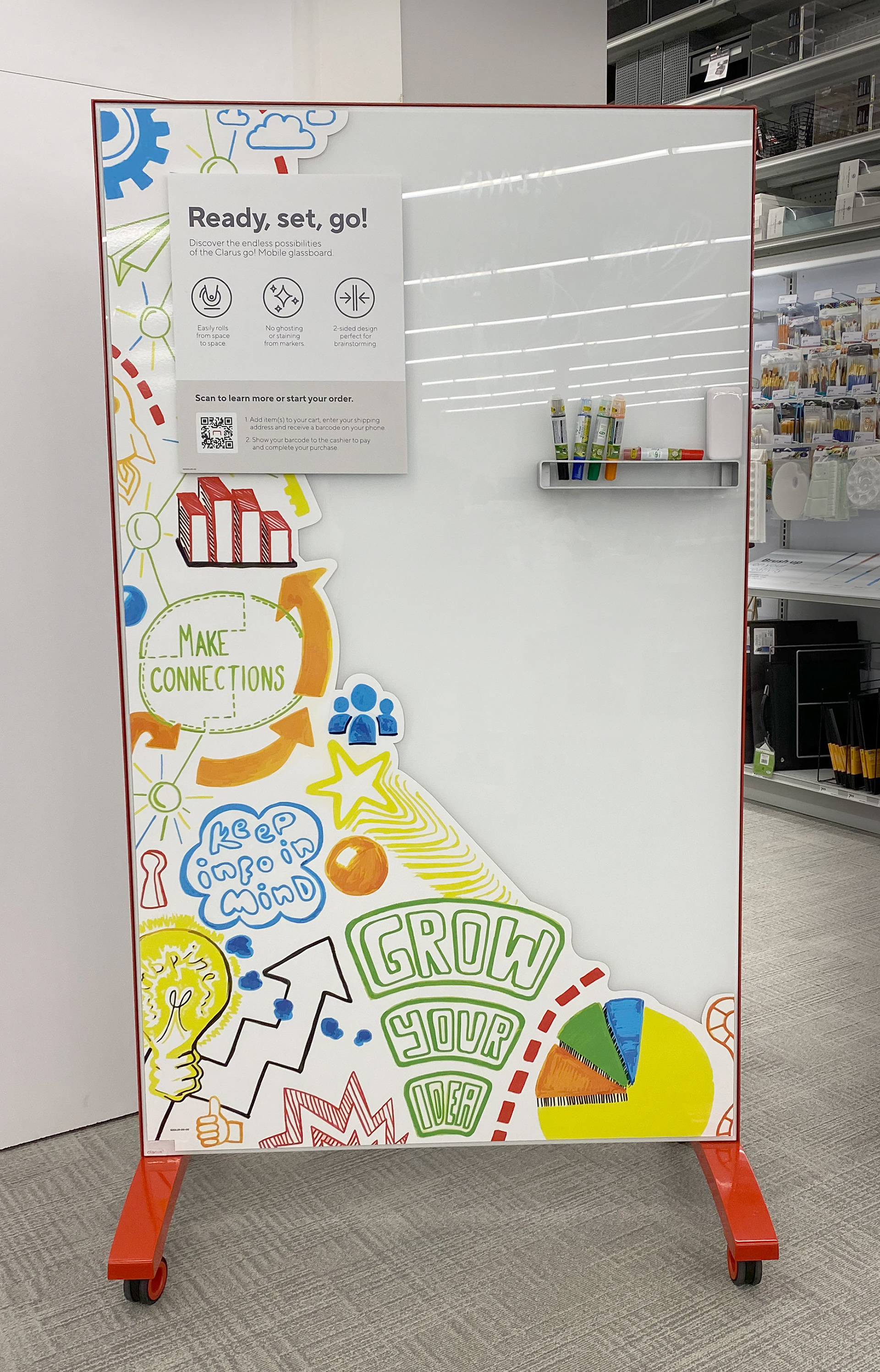
Clarus Boards
To encourage trial and exploration, I created an artistic interpretation of a brainstorm that communicated benefits of collaborative thinking. Each element was hand drawn then converted into a 72” tall decal and applied to the board, inspiring customers to add their own thinking and become part of the installation themselves.

Upgrade Your Space
Rather than try to feature this assortment of mostly wall decor in a lifestyle photo, we turned the shelf and wall into the lifestyle. We worked with our in-store display printers to figure out how to mount the product to the pegboard and styled it with Print & Marketing materials as a cross sell. The backer was printed with a wallpaper pattern and the cozy look was completed with the addition of a working lamp.

Travel Intro Poster
This flagship location features a highly interactive travel area, including real airplane seats. We were asked to create a poster to introduce this space and welcome customers to an experience they’ve likely never had at a Staples store until that moment. Inspired by vintage travel posters, I wanted to invest in creating something special to celebrate the efforts and achievements of this store experience and create a connection with customers by featuring the nearby, and world-famous, LAX airport. This is a hand drawn and painted original travel poster created in Photoshop that captures the unforgettable feeling of taking off to discover somewhere new.
Belkin Charging End Cap
Not every product assortment needs a lifestyle story. For those categories, we introduced, this dramatic product photography direction shot on concrete.
This style was so well-received that it became our go-to solution for elevated product photography for close to two years.

(Bellingham, MA)
Apply the learnings and latest developments of Staples’ brand-defining store concepts to renovate and reinvent the Bellingham, MA location, creating an in-store experience that inspires workers, small business owners, teachers, students and parents while introducing thoughtful, convenient services to help every customer make the most of their trip.
Whereas the Los Angeles flagship location pioneered numerous positions and products displays, the Bellingham flagship store used these as a baseline and allowed myself and my creative partners to evolve, or in some cases completely reinvent, how customer interacted and explored our stores. I was able to strengthen new skills, from floor planning and product arrangement, as we dug into every aspect of the store experience.


I was able to introduce and bring to life one of the world’s most recognizable brands for this flagship location. With minimal time and budget, we connected with Lego brand partners across the globe to create an engaging, multi-position experience that catered to every Lego customer, from the beginner to the expert and even the educator. We pushed the boundaries of our sign standards, challenging leadership to go big and help us create a one-of-a-kind experience for Bellingham Staples customers.


One of the focal points of this new store launch was the writing section. The strategy was to create a more inspirational space with an increased focus on exploration and trial. The hub of the set was the writing table. The structure of the table was set, but it was difficult for the team to visualize how it would all come together. I took it upon myself to mock up each section of the table, making recommendations about which products to feature in the vignettes, how to incorporate product callouts, how to layout the trial sections and concepted a variety of directions for the signage. I held multiple cross-functional meetings to get buy in on the proposed directions. Once we had approvals, I coordinated an effort to have multiple associates fill out content on the demo journals and notebooks.


Here, we took simple sign holders and transformed 20 feet of space to replicate cafe counters and restaurant tables, helping our small business customers more easily see how these products, along with custom print products from Staples, can elevate their business and the experience they offer to their own customers.
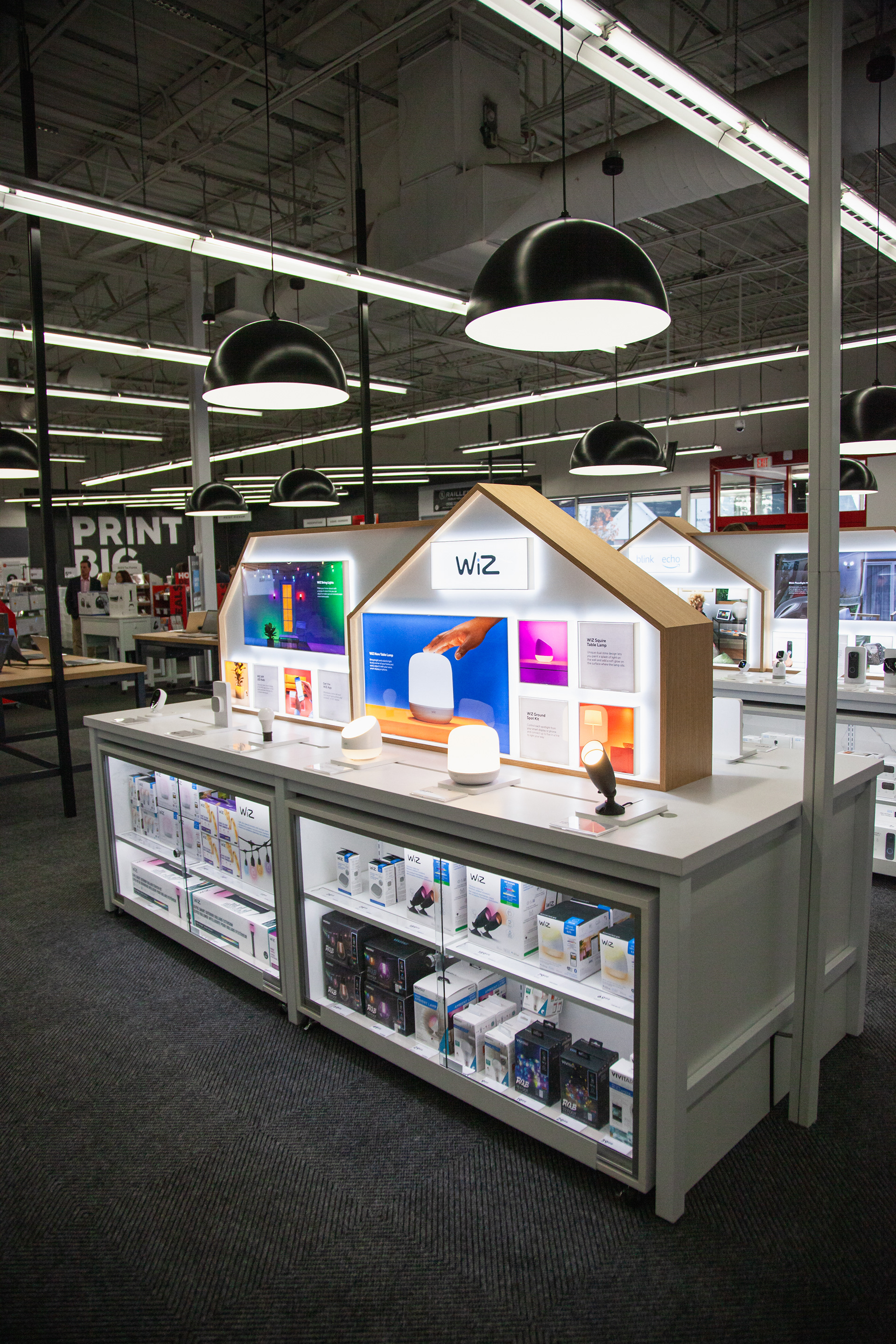

Braintree featured a brand new presentation for Staples connected home assortment. I sketched and presented multiple directions of how to showcase the signage. After a few iterations, we landed on the right house shape to not overwhelm the area and to allow for product information.

(Braintree, MA)
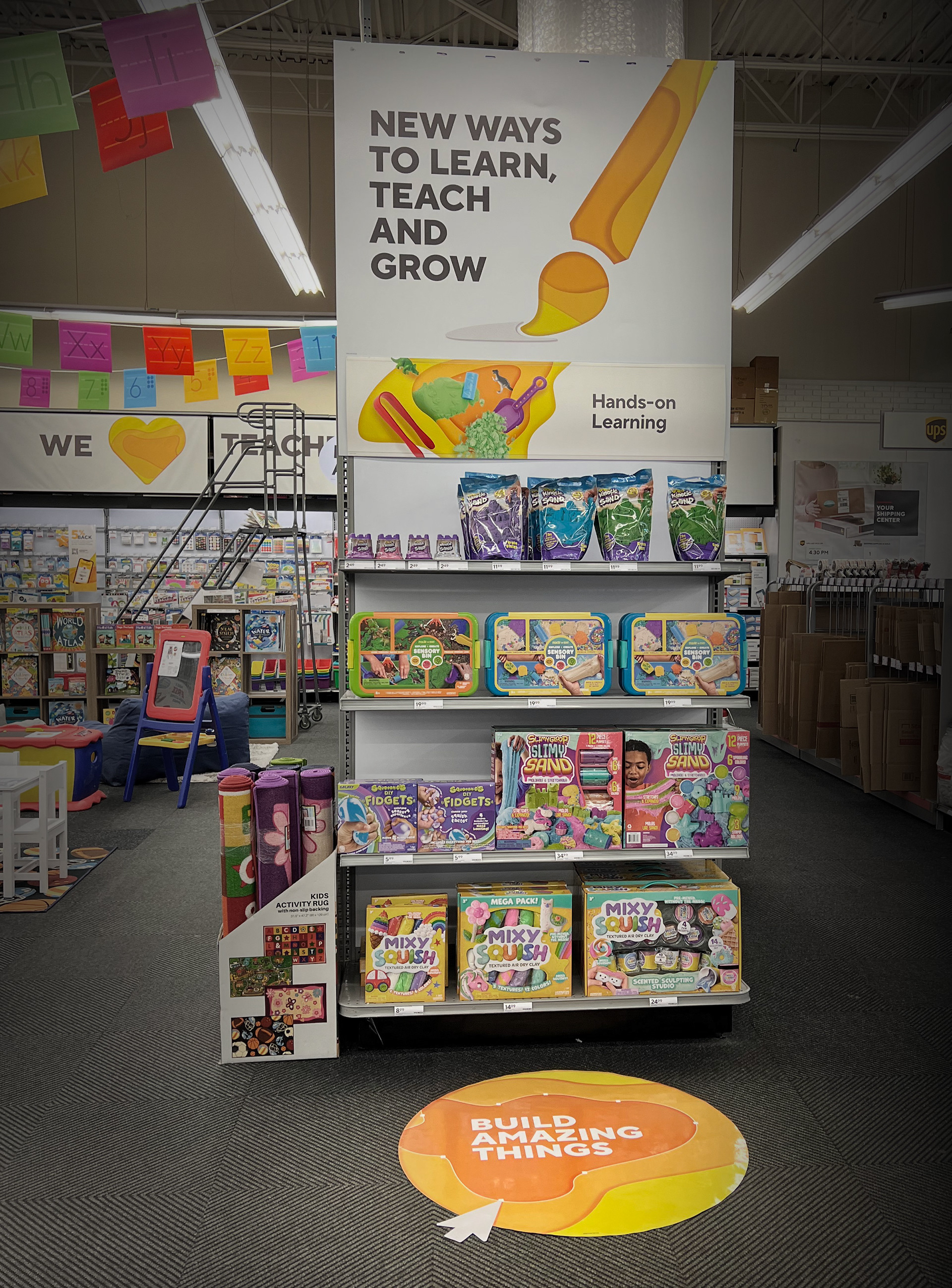
Staples was looking to become a destination for teachers by expanding and highlighting their teacher and classroom product assortment. A section of the Braintree, MA store was carved out to test this strategy
We partnered with the visual merchandising team to develop a variety of assets from floor to ceiling to help tie this area together, make sure it's attention grabbing and does not feel out of place within the overall store. The layered shaped treatment was part of Staples's branding at the time. Working that into our signage helped with brand consistency. Yellow was often Staples' main Back to School color, We leaned in on that to help define the space.